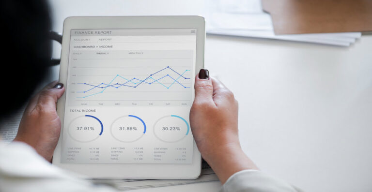
Businesses rely on data to make informed decisions and user dashboards are a great way to present vital statistics in a clear and concise manner. However, many dashboards are not designed with accessibility in mind. This can make it difficult for people with disabilities to access the information they need.
Creating inclusive and user-friendly dashboards is not only a matter of social responsibility. It also provides a strategic advantage for your organization. In this comprehensive guide, we will cover some best practices for designing accessible dashboards. We’ll also recommend some free dashboard templates you can try out.
Improve Your Site’s Accessibility Compliance:
Start a 7-Day Free Trial Now
What is a user dashboard?
A user dashboard is a digital interface that visually presents relevant data, functions, and controls to users. It’s similar to how your car dashboard displays vital information about your vehicle’s performance and status such as fuel level, engine temperature, etc.
So why does accessibility matter in dashboard design? The answer is quite simple. It ensures that people with different abilities can access and interact with data. This is crucial because everyone deserves the opportunity to data-informed choices effectively without bias to their abilities, especially in today’s data-driven world.
For businesses, investing in accessible dashboards goes beyond mere compliance with accessibility standards; it offers tangible business benefits. It ensures that employees and customers with disabilities have equal access to vital information. This, in turn, leads to improved productivity, informed decision-making, and enhanced user experiences.
Accessible dashboard design best practices
Here are a few principles and guidelines to keep in mind when designing dashboards to make them accessible to all:
1. Choose accessible data visualization techniques

The chart or graph you use to display data should not be merely decorative. It must help the user understand the data more easily. That is why it is crucial to choose the visualization that best represents the nature of your data. Some common examples are:
- Bar charts: ideal for comparing data between different categories. For example, they can be used to compare the number of product sales by country.
- Line charts: suitable for comparing data over a period of time. They are easy to analyze, making them ideal for illustrating trends and patterns.
- Pie charts: useful for indicating proportions or percentages of a whole. They provide a quick overview but may not be accurate when comparing smaller sections.
- Tables: valuable for comparing multiple items and presenting data-rich content. They offer a structured format that allows for detailed analysis and comparison.
- Scatterplots: effective for visualizing relationships and distributions. However, they are more suitable for audiences familiar with data interpretation.
Here are some general considerations to make these data visualization techniques more accessible:
- Ensure that tables have proper headers and use row and column labels to provide context. For example, you could include a summary row or column to give an overview of the data presented.
- Use clear labels for the x and y axes on bar and line charts and ensure that the lines are distinct and clearly labeled.
- Provide additional information, such as tooltips or data points, to assist users with visual impairments.
2. Ensure the dashboard is keyboard-only accessible

Not all users can rely on a mouse, so enabling keyboard access ensures that everyone can interact with the dashboard effectively. Here are some tips to help you improve keyboard accessibility in your dashboards:
Enable keyboard access and navigation for all features
Allow users to access and operate all interactive elements, such as buttons, links, and form fields using only the keyboard. This allows users to navigate through the dashboard using standard keyboard controls, like the Tab key to move focus between elements and the Enter key to activate them.
Provide skip navigation links and landmarks
Include “skip” links at the top of the dashboard to allow keyboard users to bypass repetitive menus and quickly jump to the main content. Additionally, use HTML landmarks, such as headings, sections, and navigation regions, to help users understand the structure of the dashboard.
Use visible focus indicators
Use a distinct visual style, such as a contrasting border, highlight, or color change, to indicate when an interactive element receives keyboard focus. This helps users, especially those with visual impairments, understand their current location and navigate through the dashboard with ease.
3. Optimize the accessibility of the visual design

Optimizing a user dashboard for visual accessibility involves making design choices that help users with visual impairments can easily access and understand the information presented on the dashboard. Here are some best practices to follow:
Choose colors and contrast for readability
Selecting colors with sufficient contrast is crucial for users with visual impairments. Your use of color combinations must provide clear differentiation between elements. Consider using tools to assess color contrast ratios and improve readability.
Use clear and legible fonts
Avoid decorative or overly stylized fonts that may be hard to read. Instead, choose san-serif fonts such as Verdana, Tahoma, Calibri, and Arial, as these are clear, legible, and accessible for everyone. Also, consider font size and spacing to allow comfortable reading for visually-impaired users.
Avoid excessive visual distractions
Simplicity is key when it comes to accessibility. Remove unnecessary visual distractions such as animations and blinking elements that can overwhelm or confuse users with cognitive disabilities. Your dashboard’s design should be clean, uncluttered, and focused on the essential information.
Design for scalability and responsiveness
Ensure that your dashboard design can adapt to different screen sizes and devices. A responsive design allows users to access the dashboard seamlessly on various devices, including desktops, tablets, and mobile phones. Consider the flow and arrangement of elements to maintain readability and functionality across different orientations.
4. Provide multiple ways for users to interact with the dashboard
An accessible dashboard goes beyond just providing visual content. It allows users to interact with it in the way that works best for them. Ask yourself: ‘If a mouse malfunctions or is unavailable, will people still be able to interact with my dashboard?’ If the answer is no, you have work to do.
Improving keyboard navigation is a great way to begin (we discussed this earlier in the article). Other strategies to offer alternative input options in your dashboards include:
Gesture and Touch Support
Consider implementing gesture and touch support for users who prefer to interact with touch-enabled devices. This includes supporting swipe gestures, pinch-to-zoom, and other touch-based interactions. Accommodating these features provides more flexibility for people using smartphones, tablets, or other touch-enabled devices.
Voice Commands and Speech Recognition
You can also integrate voice control capabilities into your dashboard to enable users to interact with it using spoken commands. This is particularly beneficial for people with mobility impairments or those who have difficulty using traditional input methods.
Customizable Input Settings
Give users the ability to customize input settings according to their specific needs. This may include options to adjust keyboard shortcuts, sensitivity settings for touch-based interactions, or voice recognition configurations.
Assistive Technology Compatibility
Test to see that your dashboard works seamlessly with assistive technologies, such as screen readers, screen magnifiers, and alternative input devices. It’s good practice to regularly test your dashboard to confirm it is compatible with popular assistive technologies.
💡Learn More: How To Improve Screen Reader Accessibility
5. Consider using an accessible dashboard template
Gone are the days when dashboard design was solely the realm of analysts and designers. With modern dashboard builders, anyone can now create impressive dashboards with ease. However, some users may still find them intimidating to build.
If you’re looking to streamline the dashboard creation process, we recommend using professional dashboard templates such as AdminLTE, Fluent UI, ArchitectUI, SB Admin 2, and Tableau. These templates provide pre-designed layouts and components that can be customized to suit your audience’s specific needs, saving you time and effort.
Conclusion
The true value of accessible dashboards lies not only in their compliance with accessibility standards but also in their positive impact on people’s lives. Embracing accessibility in your dashboard design process helps to equip people with disabilities with the tools they need to fully participate in an increasingly data-driven world.
With the right tools and mindset, designing accessible dashboards can be a rewarding learning experience. The key is to put users first by considering how people with diverse abilities may interact with and benefit from the presented information. By being empathetic and willing to improve, you can develop dashboards that transform data into insights for all.


![Read more about the article 8 Website Accessibility Audit Tips [With Dos and Don’ts]](https://blog.equally.ai/wp-content/uploads/2021/12/lukas-blazek-mcSDtbWXUZU-unsplash-1-300x199.jpg)