
Recent advances in technology have improved user experience on mobile and desktop devices. Features such as contrast control and light and dark modes are just a few examples of how modern devices are built to suit the needs of users.
In 2017, Apple unveiled a new intuitive feature called ‘Smart Invert’ in its What’s New in Accessibility session. Like Dark Mode, it darkens white or bright backgrounds; but it leaves some types of content untouched.
So, is there any difference between Dark Mode and Smart Invert? Yes. But it’s subtle.
Key Differences Between Dark Mode and Smart Invert
Dark Mode:
Changes the text, buttons, and other elements of the user interface so that most of your apps have a dark background.
Here’s how Apple put it:
“Dark Mode is a new dark color scheme that works system-wide and across all native apps to deliver a great viewing experience, especially in low-light environments.
“It is thoughtfully designed to make every element on the screen easier on your eyes and is seamlessly integrated throughout the system.”
Why is dark mode important? Using Dark Mode reduces glare when working with predominantly white interfaces. It creates more contrast between the content and the background, thereby limiting eyestrain and improving content readability.
Additionally, it improves accessibility on Apple OLED devices like iPhone X and iPhone XS, which can illuminate individual pixels without using any backlight.
The fact that each pixel of an OLED screen can be controlled separately while emitting its own light makes Dark Mode an important software feature of mobile devices.
Note: iOS 13’s inbuilt apps are already compatible with Dark Mode.
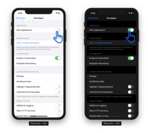
Apple’s APIs allow developers make apps compatible with Dark Mode. Many popular third-party apps also offer their own dark themes. However, such apps must support Dark Mode to be able to switch UI themes through the app’s in-app settings.
Apple has a word of encouragement for developers:
“Dark Mode is available to third-party app developers for integration into their own apps and can be scheduled to turn on automatically at sunset or at a certain time.”
Smart Invert
Darkens the white or bright background colors but does not affect content like images, media, and some apps that use dark color styles.
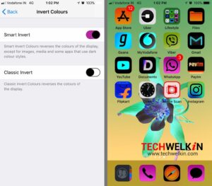
Apple introduced the Smart invert function because its Classic Invert mode changed colors of everything regardless of the content type. The Smart Invert feature, on the other hand, darkens bright and white content but leaves content like images and videos unchanged.
Dark Mode is more subtle than Smart Invert, which inverts only the UI, so content such as graphics, images, and app icons remain in their original state. As a result, iOS 11 has a dark interface or dark mode, but the rest of the content is mostly unchanged.
However, in some instances, Dark Mode does not work the same way as Smart Invert. For instance, dark mode will not change the white background of webpages or emails to black, but Smart Invert will.
Classic Invert does not account for already dark interfaces. Instead, it inverts everything. Invert Smart recognizes that the interface is already dark and leaves the colors alone.
For people with disabilities (Blindness, visual impairment)
At the moment, the best option for people with blindness is Invert Colors. Not Dark Mode, not Smart Invert, but the classic Invert colors. This is because no matter how intuitive Smart Invert is, a person who has low vision would benefit best from a regular color scheme invert.
When using Dark Mode, some elements will not be visible — sub menus or radio buttons may disappear, while classic Invert colors will display such elements, so it’s generally better for functionality.
Equally AI has special functionality in its Accessibility Assistant that lets users invert all colors on a web page — catering to the needs of people with visual impairment.
Highlights of Dark Mode
Different look: Introducing the new Dark Mode option, which gives iOS and apps a beautiful dark color scheme. Designed for low-light environments, Dark Mode is easier on your eyes and won’t disturb those around you.
Smart Schedule: You can schedule Dark Mode to turn on and off based on time or sunrise and sunset, which is great when you’re outside at night or using your iPhone before going to sleep.
Wallpapers: Wallpapers automatically change as you switch between light and dark modes.
System integration: Dark Mode is seamlessly integrated into iOS, from built-in apps to settings to system-level views.
Works with your favorite apps: Third-party developers can use the API to implement Dark Mode in their apps.
Conclusion
With Smart Invert, Apple improved its old “Invert Colors” Accessibility function to inverts all colors on the display for users with vision impairments. This relieves their discomfort when staring at the default dark color scheme for extended periods of time.
Smart Invert and Dark Mode are similar accessibility features, but they behave differently. Users may need to switch back and forth to find what works best for them.