WCAG Principle: Perceivable
Guideline 1.4: Distinguishable (Make it easier for users to see and hear content including separating foreground from background).
Conformance Level: AA (Recommended)
What is Success Criterion 1.4.3?
The visual presentation of text and images of text has a contrast ratio of at least 4.5:1, except for the following:
- Large Text: Large-scale text and images of large-scale text have a contrast ratio of at least 3:1.
- Incidental: Text or images of text that are part of an inactive user interface component, that are pure decoration, that are not visible to anyone, or that are part of a picture that contains significant other visual content, have no contrast requirement.
- Logotypes: Text that is part of a logo or brand name has no contrast requirement.
The essence of this guideline is to ensure that text stands out against its background. This makes it easier to read for users with visual impairments, such as low vision or color blindness.
Consider a website with a dark blue background (#0000CC) and white text (#FFFFFF). The contrast ratio here is high, making it easy for most people to read the text against the background. If the same website used light gray text (#CCCCCC) on a white background (#FFFFFF), the contrast ratio would be much lower, making it difficult for users with visual impairments to read the text.
How does it make your website accessible?
Websites with sufficient contrast text (4.5:1 for most text, 3:1 for large text) are easier to read for everyone, especially those with vision issues. It is helpful even just for making content easier to scan and remember. Plus, it’s one of the requirements for compliance with web accessibility laws and regulations.
Who benefits?
- People with low vision
- People with color vision deficiencies (e.g., color blindness)
- Older adults experiencing age-related visual changes
- Users viewing screens in high-glare or bright environments
- People using devices with small screens or low-quality displays
- Everyone, by enhancing overall readability and user experience
How to Meet Success Criterion 1.4.3
Common contrast mistakes on websites:
- Placing text over decorative background images
- Using subtle color differences for text and backgrounds
- Ignoring contrast in user interface and non-text elements
- Designing disabled state elements with low contrast colors.
- Assuming good contrast in light mode equals good contrast in dark mode
How to fix mistakes:
- Use background shading or an overlay for text over images or gradient to ensure the text remains legible.
- Select colors with a minimum contrast ratio of 4.5:1 for text and background colors.
- Increase the contrast for buttons, links, and interactive elements to meet or exceed the minimum contrast requirements. This includes text, icons, and other graphical elements within these components.
- Differentiate disabled elements with sufficient contrast while clearly indicating their state.
- Independently evaluate contrast ratios in all supported themes or modes to ensure text and elements are legible across different settings.
Helpful tips for web designers/developers:
- Integrate accessibility testing tools and plugins into your workflow to automatically check for contrast issues.
- Use established accessible design patterns that comply with contrast guidelines.
- Test your designs under various lighting conditions and on different devices to ensure text remains legible in real-world use cases.
- Provide text alternatives (alt text) for elements where achieving sufficient contrast is difficult.
- Ensure every part of the website a user interacts with maintains sufficient contrast, not just your homepage or ‘important’ pages.
How to test if your website meets conformance:
- Check if a contrast ratio of at least 4.5:1 exists between text (and images of text) and background behind the text.
- For large-scale text, (18 point or 14 point bold), check if a contrast ratio of at least 3:1 exists between text (and images of text) and background behind the text.
- Check if there is a clear, visible control that allows users to switch to a high-contrast presentation.
Bad and Good Examples
Example of a website design that fails SC 1.4.3 contrast (minimum)
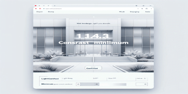
The image above illustrates a web design with poor contrast, featuring light grey text on a white background. This design fails to meet the Success Criterion 1.4.3 Contrast (Minimum), because it will be hard for users, especially those with vision issues, to read and interact with its content.
Example of a website design that meets SC 1.4.3
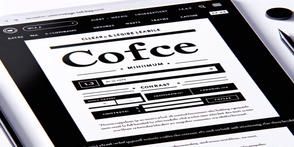
The image provided showcases a web design with strong contrast, featuring black text on a white background. This layout meets the WCAG 2.2 Success Criterion 1.4.3 Contrast (Minimum), highlighting how high contrast between text and background improves readability and accessibility.
Frequently Asked Questions
What is the minimum contrast ratio required by WCAG 2.2 for normal text?
The minimum contrast ratio required for normal text and images of text is 4.5:1, except for large text. For large text (18 pt or 14 pt if bold), WCAG requires a contrast ratio of at least 3:1.
How do I measure the contrast ratio?
You can measure contrast ratio using online tools and software that calculate the ratio based on the colors of the text and its background. We strongly recommend using Flowy contrast checker to quickly find and fix contrast issues on your web designs.
Are there exceptions to this criterion?
Yes, exceptions include text or images of text that are part of an inactive user interface, purely decorative, not visible to anyone, or part of a picture that contains significant other visual content.
Does this criterion apply to mobile applications as well?
Yes, the principles of WCAG, including contrast requirements, apply to mobile applications in addition to web content to ensure accessibility across all digital platforms.