
WCAG Principle: Perceivable
Guideline 1.4: Distinguishable (Make it easier for users to see and hear content including separating foreground from background)
Conformance Level: A (Minimal Requirement)
What is Success Criterion 1.4.1?
Color is not used as the only visual means of conveying information, indicating an action, prompting a response, or distinguishing a visual element.
Color plays a crucial role in visual perception. It defines the tone of a website and emphasizes various design elements. Types of content that rely on color to convey essential information required form fields (often highlighted in blue) error or warning messages (often displayed in red), colored charts that differentiate between chart-elements, etc.
Nevertheless, if color is the only way to display specific information, then users who cannot see or differentiate colors will be unable to access this information. A common solution to this issue involves ensuring that, where information is conveyed through color differences, it is also available in text or through another visible indicator, such as an underline, pattern, or shape.
How does it make your website accessible?
The purpose of this success criterion is to ensure that all sighted users can access information conveyed by color differences, that is, color with a meaning. By conveying color-based information in another visual manner, users who cannot see color can still understand it.
Who benefits?
- Users with low vision impairments which affect color perception.
- Older users who may have difficulties seeing colors well.
- Users who are color-blind benefit when information conveyed by color is available in other visual ways.
- People using limited color monochrome displays.
- Users who have problems distinguishing between colors.
How to Meet Success Criterion 1.4.1
Common mistakes:
- Forms use only color to indicate required fields.
- Using colors to signal essential content, pass/fail status, etc.
- Color is the only way to distinguish links from plain text, and the color does not differ from the main body text.
- Color differences in images do not convey any information in alternative text.
How to fix mistakes:
If content used the color of particular words, backgrounds, or other content is used to indicate information, do the following:
- Ensure that the information conveyed by color differences is also available in the text.
- Provide a text cue for colored form controls
- Use additional visual cues to convey information when using color differences in text.
Helpful tips for developers:
- Use CSS, HTML and XHTML to enhance the page’s visual appearance and provide visual feedback when an interactive element has focus or when a user hovers over it using a pointing device.
How to test if you’ve met compliance:
- Visually examine the website to see if any information is being conveyed only through color. Viewing it in grayscale (black and white) may be helpful.
- Pay particular attention to problematic elements that use colors, such as graphs, diagrams, and error messages on forms.
- Use the colorblind simulator in the Accessibility Inspector in Chrome or Firefox Developer Tools to see how your page will look to color-blind users.
Bad and Good Examples (Pictures and Developer Code)
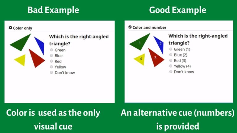
In the first example, color alone is used to differentiate between triangles. If the person responding to this question is color-blind, it will be almost impossible for them to provide the correct answer.
In this second example, the question uses another element (numbers) besides color to tell the triangles apart. This is good practice.
Frequently Asked Questions
What is the use of color?
The use of color is one of the most powerful tools in website design. Using accessible color on your website can attract visitors and help convey significant meanings to content. People also process and mentally store colored images more efficiently, which can increase brand recognition and conversions.
What is the principle and intent of SC 1.4 1 use of color?
The principle and the intent of SC 1.4.1 use of color is to ensure that sighted users can access information conveyed by color differences, i.e., where every color has a specific meaning. For example, a link marked with color must be distinguished from adjacent non-link text by means other than color alone. These include font type or size, underlining, bolding, or frames.
Why is color alone insufficient to draw attention to actionable elements or to convey state?
Color alone is insufficient to draw attention to action elements or to convey state because it causes barrier access for many readers. For instance, colorblind and low vision users may not be able to identify the color differences. Also, screen readers cannot read out colors, which makes using colors alone to express meaning problematic for blind users.
What are the issues to be considered when using color to convey your message?
Issues to be considered when using color to convey your message includes adding a textual alternative where color is used to instruct a user to take action. For instance, an instruction that reads, “Click on the blue button to continue” is not accessible since some users may not be able to see the color blue. Rather, the instruction should read “Click on the blue Start button to continue”.